Technical writers are wordsmiths. They are experts at analyzing a situation, and writing the document that is needed. They can organize topics, break down tasks, write steps and procedures, and produce a wide variety of documents on a vast array of subjects.
All too often, though, the documents are either plain and boring, or too complex to comprehend. Written content alone does not convey a message adequately.
Visual design to the rescue! Visual design encompasses everything from font color, size and type, to the size of the page and location of toolbars. Understanding the basics of visual design allows writers to make their documents effective and usable.
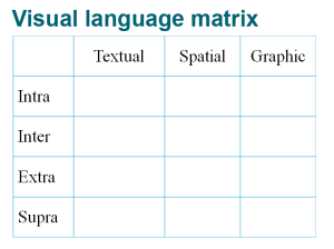
There are four levels for examining visual language.
- Intra: Linear components, such as font style, size, spacing, and effects such as underlining
- Inter: Fields and nonlinear components, such as headings, numbers, bullets, lines, and shading
- Extra: Data displays, pictures, icons and symbols, such as tables, figures, charts, and all the relevant components such as style, angle, captions, and call-outs
- Supra: Top-down design elements, such as page size and orientation, title pages, chapter and section titles, logos, and backgrounds
There are also three modes of design elements.
- Textual
- Spatial
- Graphic
The Visual Language Matrix, developed by Kostelnick, demonstrates how these levels and modes relate. By analyzing and understanding these components, technical writers can strengthen their documents.
For more reading on Kostelnick’s work, check out https://pantherfile.uwm.edu/alred/www/pdf/kostelnick-rhetoricoftext.pdf

